Notifications
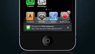
The easy part of this concept concerns the notification system, designed to be less invasive of the current implemented by Apple. Pop-ups are not in fact appear in the center of the screen but will appear at the bottom of the display in the dock designed for multitasking.
This system would be compatible with both the notifications that true with other elements, such as receiving SMS on the iPhone. As you can see from the new pop-switchers would be less bulky dock Multitasking IOS 4 and would be in line with the rest of the interface.
New Application Notifications
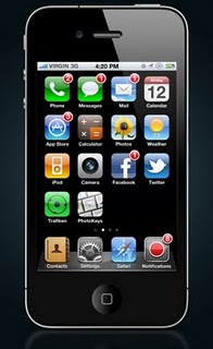
The application icon is taken from the symbol of the notifications in the settings of IOS. The author suggests and considers useful to the inclusion of a single application that collects all the notifications received. There is an app for everything? Well, this concept is an app for the notifications!
It would thus be organized interface for applications which would be collected all the notifications received from various services. In addition, each label (application) would show a small badge to show the cumulative number of specific notifications received from it. Useful, simple and practical.
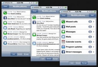
The application itself is very simple. Notifications are displayed in three different ways: in chronological order, so extended to read the entire contents, or in an organic way as previously reported. In all modes of display notifications can be “cleaned up” without losing any of your messages. You can also select and delete individual notifications.
A feature that was not foreseen but the designer is the one that would allow the user to respond to a notification (eg a message on Facebook) directly from the Notifications.
Settings
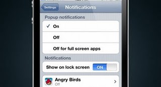
The standard settings for notifications of IOS are located within the application notifications. Among these are new privacy setting (full view of the message or not, pop-up pop-up view of the notifications in lockscreen, etc.). Currently, with IOS 4.3.2, if you receive a text message, the message will appear as pop-up inside the lock screen.
Also introduced was a feature that allows the user to stop receiving notifications when using full-screen applications, such as Angry Birds in general or the games available in the App Store. Of course you can also turn off notifications based applications, just as is currently possible.
Lock Screen
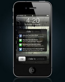
Notifications in the Screen Lock, albeit small (can be viewed one at a time and have little interaction with the user), are already present in IOS. In this concept, however, the notifications in the lock screen is completely revised. More notifications collected in a single box and a “slide to view” this just below the clock. In this space you will only see some information that will be entered and displayed in chronological order, from newest to oldest.
To read a notice has been devised a really clever: just like the “Slide to unlock, just press the application icon for which you received a notification and then drag to the right. This will open the application in question and you can read the notification.
This reduces the risk of opening inadvertently (and thus to mark as read) a notice received from IOS.
How about this concept? Would you like to see a push notification system similar to this in iOS 5?
Via
Imp0rtant P0sts Fr0m Redsn0w.us:

