Many people still waiting for September 18th to download iOS 7 on their devices, I know that everyone is so excited, I can tell you that iOS 7 contains a lot of new improvements/features and a new whole design which makes it very different from iOS 6…
iOS 7 is none of that. Apple has really worked at changing just about everything, but like the Windows 8 OS to which iOS 7 is now drawing comparisons thanks to the bold colors and straight lines, it feels a little too much, too soon.
So what I want to say, iOS 7 is an improvement on iOS 6 in terms of features, but the look is not selling itself to me at all. In-app, the clean-up job is plain for all to see, and while there are some stand-outs (the Weather app, for example, is quite delightful), it would appear as though Apple has gone from cruising, coasting, and relaxing on one look and taken things too far the other way, bringing an altogether offensive, rather vulgar brightness that users without Ray Bans cannot turn off in preservation of their eyesight.
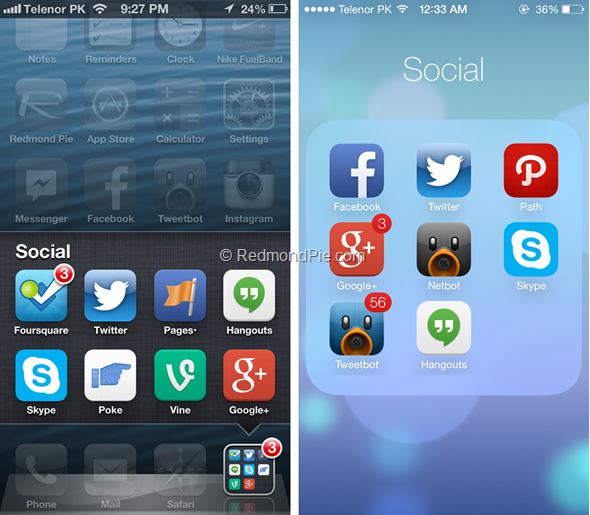
Today I’ve got for you a group of screenshots that shows a quick side by side visual comparison between iOS 6 and iOS 7..
A big thanks for Redmondpie for these pictures:
 |
| Home Screen |
 |
| Contacts app, with incoming notification banner |
 |
| Making a Phone call |
 |
| Stocks app |
 |
| Settings app |
 |
| Spotlight Search |
 |
| Weather app |
 |
| Game Center |
 |
| Folders |
 |
| App Store |
Overall on the whole, iOS 7 may look better than its predecessor, but I think Apple has tried way too hard. It would be nice to see things toned down through the next handful of betas before the final release, bringing back some of the reserved charm which has helped iOS rise to such prominence.


