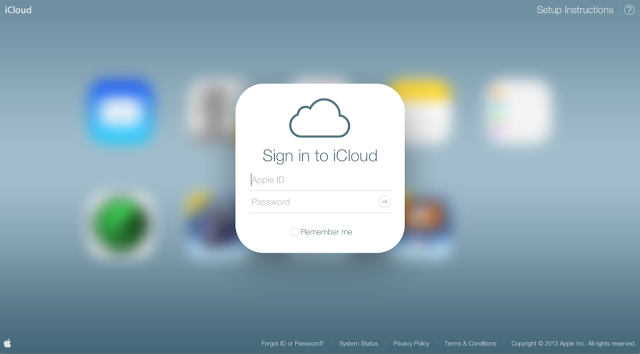
There’s still time till the iOS 7 gets released publicly, but that hasn’t stopped Apple from rolling out a new, redesigned version of iCloud.com. The redesign has been inspired by iOS 7 itself and after being in beta for months, it is finally here.
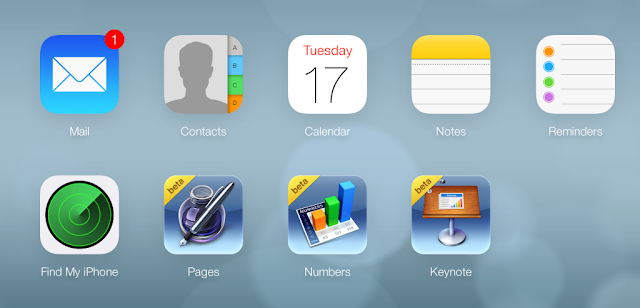
The new version features new icon changes and elements, plus redesigning of apps to compete with iCloud for iPhone. Users visiting the website are going to see a new wallpaper that emulates the slow, dynamic wallpaper of iOS 7 as well as plethora of apps such as Calender, Notes, Find My iPhone, Reminders, Contacts and Mail.
Also, several photos surfaced online last month showcasing how the web interface of the iCloud was turning out to be, but as it was in beta, the real outcome has changed only slightly. Feel free to head over to iCloud.com and login with the iTunes account to see exactly how the new web portal has turned out to be.
You can see the new based interface through a tablet, but it’s recommended to use a Mac for as it also allows for proper syncing. Also make sure that you login from the account that you use across iDevices.
So what do you think of the new interface? Does it appeal to you? Feel free to leave comments.


