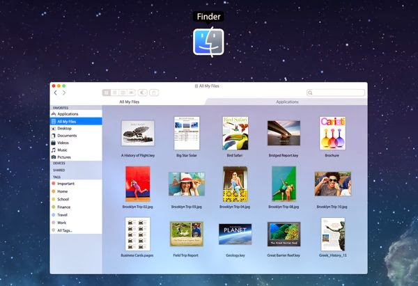
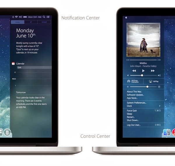
First off is the look of the OS, which is flat and colorful (although the Finder sidebar items could do with a lick of paint). But more impressive are the revamped Notification Center, with its frosted-glass looks, and the new Control Center.
The actual elements included in the Control Center aren’t so useful: who needs brightness and volume sliders when there are hardware keys on the keyboard to adjust screen and sound? But the album artwork looks nice, and the menu item shortcuts might be handy for non power users. Why, it’s a lot like the customizable Apple menu of old.
Wonderful isn’t it ? A nice concept, wonderful iOS 7 inspired redesign… Would you like to see something like the above design on your Mac OS X ? Share your thoughts and let us know your opinion about this concept.


