Since iPhone is here and this smart device is growing in a very strange way to lead the markets all worldwide. More than 30 million sales per quarter, the popular handset has become a large part (over half) of Apple’s business.

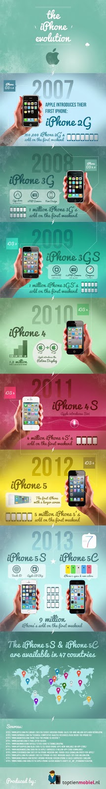
Today we’ve got a new infographic made by Top Tien Mobiel (via The Loop). And I think the best thing to describe how the iPhone has grown in the past few years is this little infographic:
 |
| Open The image in new tab for full resolution |
While overall iPhone sales aren’t increasing from quarter to quarter as rapidly as they were say, 2-3 years ago, they’re still very impressive. Apple’s opening 5s/5c weekend was nearly double that of the iPhone 5.
I also find the hardware and software changes from year-to-year interesting. Note how different the iPhone 3G and 4 appear—just 1 generation apart. And then of course there’s the iPhone 5c and iOS 7.

