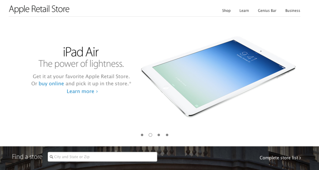
Gone are the skeuomorphic graphics, textured backgrounds and borders, which have all been replaced by healthy doses of white space and of course, thinner fonts. There’s also now an edge-to-edge image of the Amsterdam Apple Store on the new landing page…
The redesign, first spotted by ifo Apple Store, affects the main store list and individual store pages. The overall layout, including the location of drop-down menus and navigation buttons remain the same as before, but UI elements have received an iOS 7-makeover.


