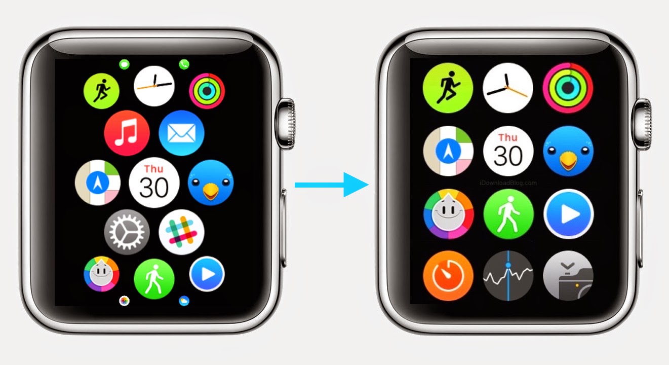
With the Apple Watch Home screen, Apple introduced a new layout and design that is a departure from what we have all been accustomed to with iPhone and iPad. Instead of favoring rows and columns of square-ish icons, Apple had to rethink the user interface and introduced us to an infinite and honeycomb-like fluid grid of apps devoid of pages, folders, or dock.
Below, you can find a few tips to improve your home screen experience so you will love and not loathe going there.
Arrange the icons creatively
You can arrange the icons on your home screen in any pattern or shape you desire — hexagons, helixes, branches and more. It takes time and patience at first to move the icons around, but it can be accomplished quickly once you get accustomed to their movement. There are some limitations to your design, though, as the Watch Face icon cannot be moved from its central position and all icons must be contiguous, i.e. touching another icon. You can see some example layouts below that were posted on MacRumors forums.

You can move your icons quickly on the Watch using a method borrowed from iOS — just tap and ow toold an icon until it and all surrounding icons start to jiggle. Once they are jiggling, you can move them around. You also can arrange the icons using your iPhone, which is the preferred method as it is much easier to see your arrangement on the large screen. Just open the Watch app on the iPhone, select My Watch and then select “App Layout.†You can drag and drop icons at will from this screen.
Group similar icons together
You can’t organize the app icons on the Watch into pages like you can on the iPhone, so you have to think creatively on the Watch. Instead of pages, you can group similar app icons together into clusters and use the layout design to keep them distinct. For example, you could use a series of small diamonds with each diamond-shape containing a different category of apps.
Use the Digital Crown to open apps
The app icons on the home screen are small, which makes it difficult to tap the correct icon when opening an app. An easier way to launch an app is to center it on your screen and spin the digital crown to zoom into the app and open it.
So what do you think ?


